

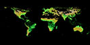
![Average Land Surface Temperature [Day]](/images/datasets/132x66/MOD_LSTD_CLIM_M.jpg)
![Average Land Surface Temperature [Night]](/images/datasets/132x66/MOD_LSTN_CLIM_M.jpg)

![Land Surface Temperature Anomaly [Day]](/images/datasets/132x66/MOD_LSTAD_M.jpg)
![Land Surface Temperature Anomaly [Night]](/images/datasets/132x66/MOD_LSTAN_M.jpg)
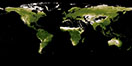
![Land Surface Temperature [Day]](/images/datasets/132x66/MOD_LSTD_M.jpg)
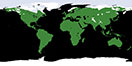
![Land Surface Temperature [Night]](/images/datasets/132x66/MOD_LSTN_M.jpg)


Applying the right color palette to an image is crucial to conveying the right message to your audience. There are obvious no-nos in map-making like, do not color land and water blue because it may look like your entire map is water. Or, do not color a disaster map green because it may convey a message of positivity. This tutorial series will show you how to apply and save different color palettes, but it is important to look into why different colors are chosen, basic color theory, and best practices for choosing the right palette. There is a 6-part series on Earth Observatory published several years ago called the “Subtleties of Color” that is still a great base to start from before making and applying your own palettes. If you already feel comfortable with your knowledge and use of colors, let’s make color palettes!

Each NEO image is natively grayscale and the color table is applied in post-processing to display the colored image on each dataset’s page. Underneath the image is a downloadable Adobe Color Table (ACT) that can be saved and used to create and save color palettes for other grayscale images.
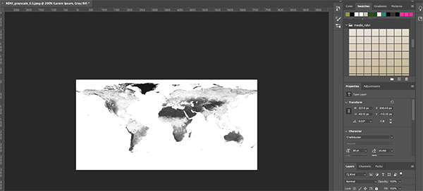
Let’s look at the Vegetation Index (NDVI) MODIS imagery as an example for applying a ready-made color table for the dataset following these steps:
Step 1. Download and save the color palette displayed for the NDVI imagery (filename: modis_ndvi.act) and a grayscale PNG at the temporal and spatial resolution of your choice. I saved the files to my desktop so they would be easy to find.
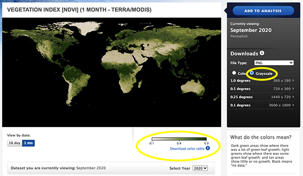
Step 2. Open Photoshop and load the grayscale NDVI image into a new project.
Step 3. Make sure the swatches window is open. There should be a check mark next to “Swatches” and the window should appear on the top right.
Step 4. In the swatches window, expand the hamburger button on the right and click Import Swatches
Step 5. Navigate to where you saved the ACT file and open the file. You should now see the color palette in the Swatches window under its filename and you will be able to access it later and even reuse some of the colors for your own palette creations.
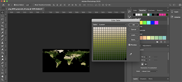
Step 6. Now go to Image, Mode, and select Indexed Color. Keep the default settings and click Ok. Your image name should have changed to “index”.
Step 7. Go back to Image, Mode and select Color Table…
Step 8. Select Custom from the drop-down menu at the top of the window and click Load…
Step 9. Navigate to the modis_ndvi.act file, select the file, and click Ok.
Step 10. The color applied to the map should now look the same as what is on our site for the MODIS Vegetation Index dataset.
Now we are ready to move on to part 2 where we will learn how to apply a custom color palette that is color-blind friendly. See you then!
Thanks –