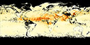

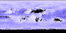

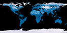
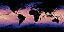
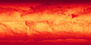
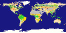
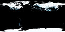
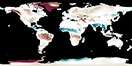
![Average Land Surface Temperature [Day]](/images/datasets/132x66/MOD_LSTD_CLIM_M.jpg)
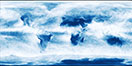
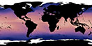
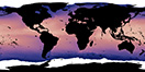
![Average Land Surface Temperature [Night]](/images/datasets/132x66/MOD_LSTN_CLIM_M.jpg)

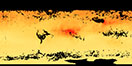
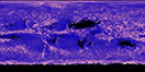
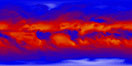
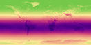
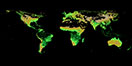
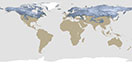
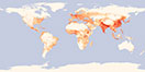
![Land Surface Temperature Anomaly [Day]](/images/datasets/132x66/MOD_LSTAD_M.jpg)
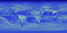
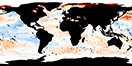
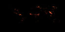
![Land Surface Temperature Anomaly [Night]](/images/datasets/132x66/MOD_LSTAN_M.jpg)
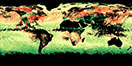
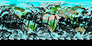
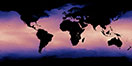
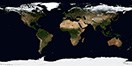
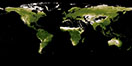
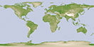
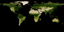
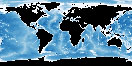
![Land Surface Temperature [Day]](/images/datasets/132x66/MOD_LSTD_M.jpg)
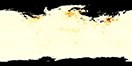
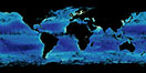
![Land Surface Temperature [Night]](/images/datasets/132x66/MOD_LSTN_M.jpg)


Now that we have finished part one and understand how the color table provided with each dataset on NEO is applied to each grayscale map, let’s focus on creating custom color palettes that are easy for everyone to see.
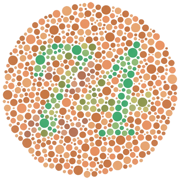
Color-blindness is a common condition that prohibits some individuals (mostly men) from distinguishing between colors. Especially, red and green.
“Roughly 1 in 20 people have some sort of color vision deficiency.”
U.S. Department of Agriculture
Luckily, there are plenty of resources that can help with creating color-blind friendly maps. Color Brewer is one great place to start for pairing colors together and we will use the site throughout this part of the series to guide our color decision-making.
Follow these steps to surf through Color Brewer and customize a color palette that suits your needs and the color-blind:
Step 1. Navigate to the Color Brewer site and make sure the colorblind safe box is selected.
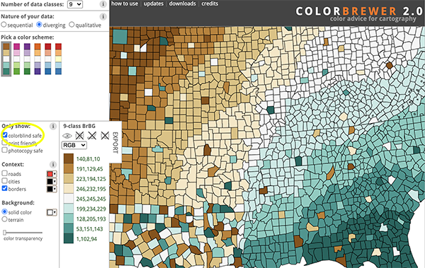
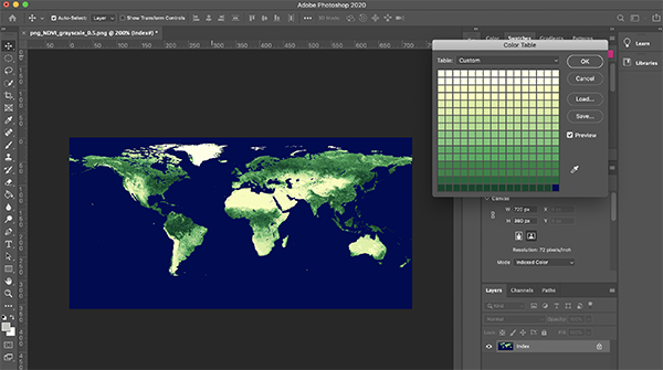
Step 2. Select 9 classes so you will have plenty of colors to work with for an 8-bit dataset. An 8-bit dataset has 256 values (0-255) which means the color table we are working with is a 16 x 16 grid. This will make more sense when we are looking at the color table in Photoshop. You could select 8 classes so every two rows have a different color, but I like to graduate the color to one row at the end. I encourage you to play around with a few combinations and decide what is best for your map.
Step 3. Instead of the default HEX codes, Select RGB from the drop down.
Step 4. Pick a color scheme. I am going to choose the yellow to green combo under sequential multi-hue. It is similar to what we are displaying now but lighter and I really want the water to be more of a dark blue rather than black.
Step 5. Go back to Photoshop and open the Color Table window again (Image, Mode, Color Table…). To make it easier, my Color Brewer window and Photoshop application are sitting side-by-side on my screen.
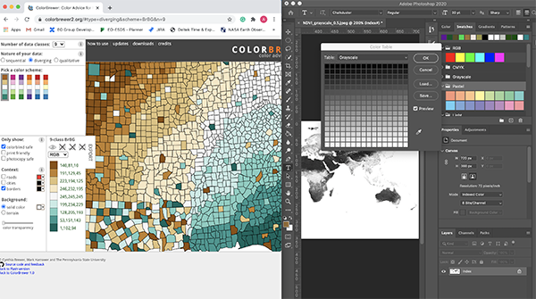
Step 6. Select two rows at a time on the color table and change the color using the RBG values that are on Color Brewer for the scheme you selected. Repeat this step as you move down the color bar until you get to the last two rows. Then you can graduate to one row and use the darker colors at the bottom of the scheme for the last two rows. The very last color (0) on the table is the map’s water (technically, it is areas of no data that are also where the oceans are). I chose to make the water a dark blue color rather than black.
Step 7. Save the color table you have created to load to another map if you like what you see.
Spend a little more time trying out different colors and using the options Color Brewer provides. Keep in mind, the map represents a dataset and in this case we are trying to show areas of less and more vegetation. Choose wisely on the colors you want to represent places with dense and sparse vegetation. Next time we will look at creating a custom color palette from scratch and applying it to your map.
Now if someone could fix the grey maps of the world with the red dots on them (the quick locator map on every EO IOTD) so that my red-green colorblind friend could see quickly where the image was taken, we’d be set!
Example:
On the top right portion of the page the detailMap is grey with a red dot to indicate location. Even just changing the dot to an arrow would help!
https://earthobservatory.nasa.gov/images/147424/snowy-and-icy-peaks-with-very-different-origins
Thank you for the feedback, Steven. I will forward your comment to the team to see if we can make that map more color-blind friendly.