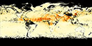


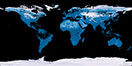
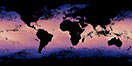
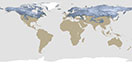
![Average Land Surface Temperature [Day]](/images/datasets/132x66/MOD_LSTD_CLIM_M.jpg)
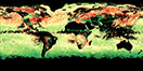
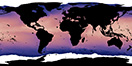
![Average Land Surface Temperature [Night]](/images/datasets/132x66/MOD_LSTN_CLIM_M.jpg)

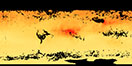
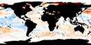
![Land Surface Temperature Anomaly [Day]](/images/datasets/132x66/MOD_LSTAD_M.jpg)
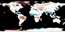
![Land Surface Temperature Anomaly [Night]](/images/datasets/132x66/MOD_LSTAN_M.jpg)
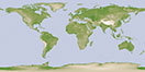
![Land Surface Temperature [Day]](/images/datasets/132x66/MOD_LSTD_M.jpg)
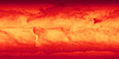
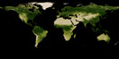
![Land Surface Temperature [Night]](/images/datasets/132x66/MOD_LSTN_M.jpg)


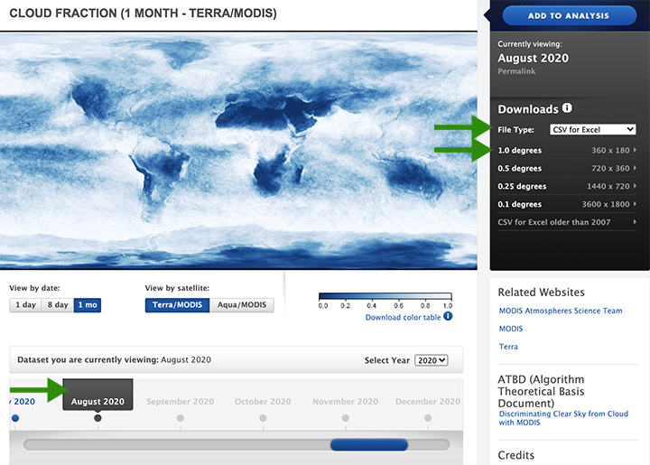
Did you know you can use Excel to visualize raster datasets? If not, follow this short tutorial and find out how.
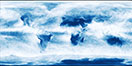
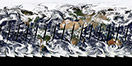
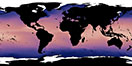
Let’s use the cloud fraction imagery NEO provides for this example.
Step 1. Go to the cloud fraction imagery page and choose the CSV for Excel download option from the drop-down at 1.0-degree resolution for a month and year of your choice. I am going to download the latest monthly image for August 2020.
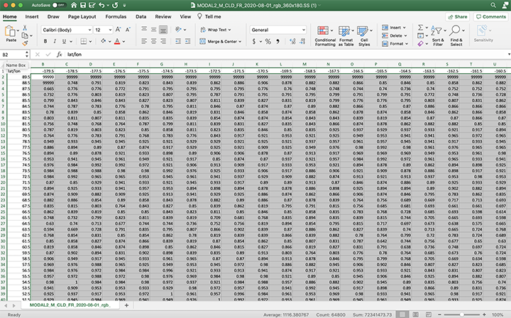
Step 2. Open the CSV in Excel and select all data except for the latitude and longitude row and column (which are the first row and first column).
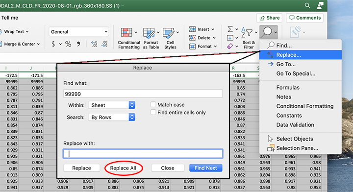
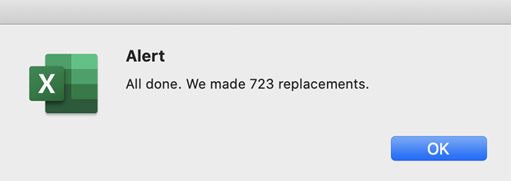
Step 3. Find and replace all 9999 values with an empty cell. I pressed the space bar a couple of times in the Replace with: cell. Once you click the Replace All button, an alert message will come up, and you will notice the cells that previously had 9999 are now empty.
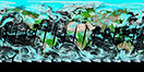
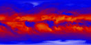
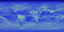
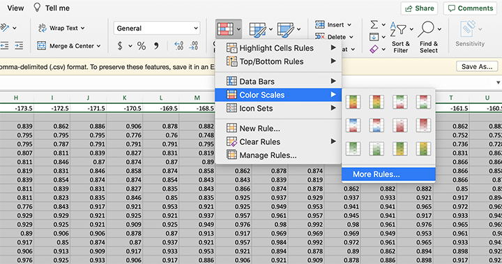
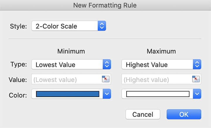
Step 4. From the Excel home tab: Select conditional formatting, color scales, and choose one of the 2-color scheme options available or select More Rules… and choose a different minimum and maximum value color. I am going to choose blue for the minimum color and white for the maximum color to create a look similar to what is available on the cloud fraction page.
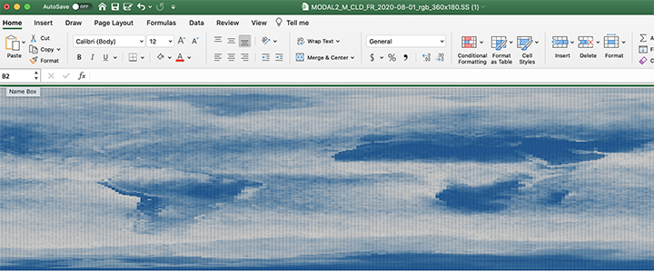
Step 5. Zoom out using the slider on the bottom right side of the excel window and you will notice the global imagery taking shape.
I remember learning the difference between raster and vector data in my entry-level GIS courses. Vector data is all of the point, line, and polygon data while raster data is made of cells or pixels. I wish my professor would have shown me how to visualize raster data in Excel at the time to really grasp cell values that make up the imagery we see as a whole. It certainly would have been easier to process!
Please share what you process in the comments below. We would love to hear any feedback or suggestions you may have.
Leave a Reply